
Video Tutorial – How to interpret the results for an AI simulation
1. Orbital Stack Analysis Types:
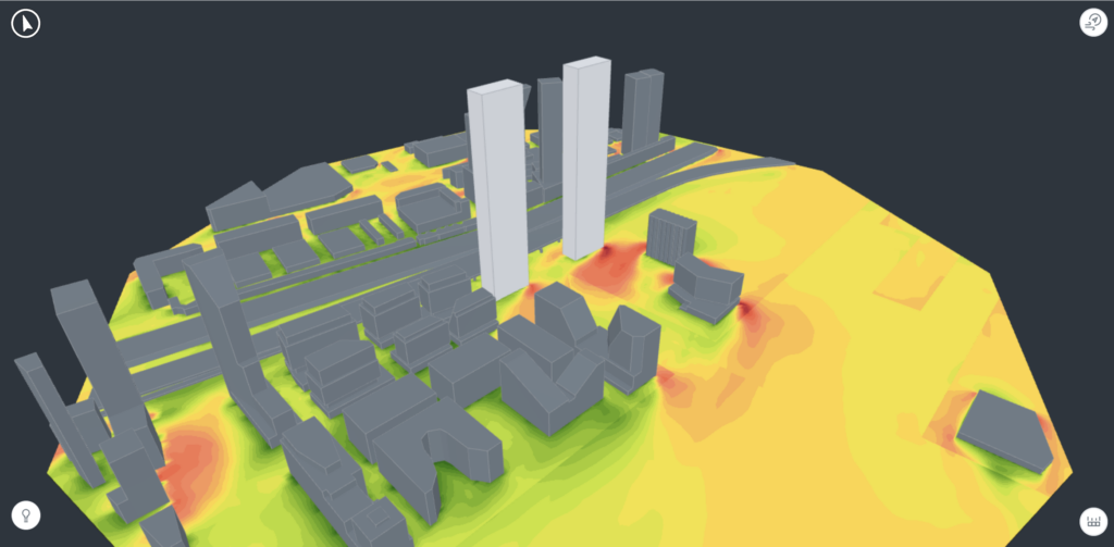
1.1 Wind Comfort
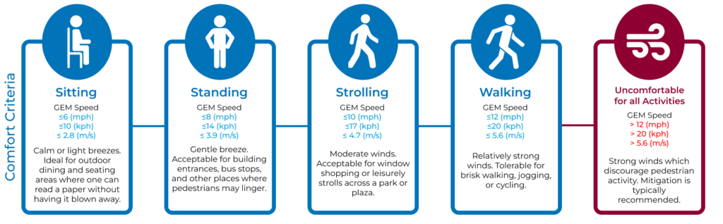
Pedestrian wind comfort is a measure of how local wind patterns impact the pedestrian experience. The speed, direction, and gustiness of winds can all affect how comfortable pedestrians will feel in a certain space. As a general rule of thumb, higher wind speeds and – in particular – strong wind gusts – result in decreased pedestrian comfort. Very strong winds can affect pedestrians’ balance and stir up debris, posing a considerable safety risk.
Wind Comfort Criteria approximate this effect by identifying maximum tolerable windspeed thresholds for various pedestrian activities. Furthermore, they will specify an “allowed exceedance” value, usually expressed as a percentage; this allowance specifies how often winds can exceed the threshold windspeed to remain in the ‘comfortable’ range.
In general, wind speeds for a given location are determined by aggregating hour-by-hour wind data with the local flow patterns established by the simulation or wind tunnel measurements. At baseline, wind conditions can be characterized by the steady-state wind speed (average intensity without gusts). Some criteria, such as RWDI’s Wind Criteria, combine the effects of that steady state wind speed with a characterization of the wind gusts to generate a more comprehensive measurement of the “perceived wind intensity”.
– Abridged Comfort Criteria Color Legend Explained
This color scale indicates the Abridged Comfort Criteria which is a simplified version of RWDI’s criteria.
The scale displays three types of zones. These indicate what a specific location is best suited for (80% of the time or more, statistically):
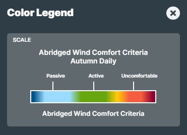
- Passive – Calm or light breezes desired for outdoor restaurants
- Active – Moderate winds that would be appropriate for window shopping or strolling down a street, plaza or park
- Uncomfortable – Strong winds considered a nuisance for pedestrian activities, mitigation typically recommended
Navigate to the Knowledge Base to learn more about wind comfort metrics and interpreting results.
1.2 Thermal Comfort
Orbital Stack’s Thermal Comfort analysis provides objective metrics (e.g., SPMV*, UTCI) and vivid imagery that show how outdoor spaces meet their desired usage profiles. Thermal comfort is a complex concept as it accesses an individuals perception of temperature which are reliant on both physiological/environmental causes and psychological factors.
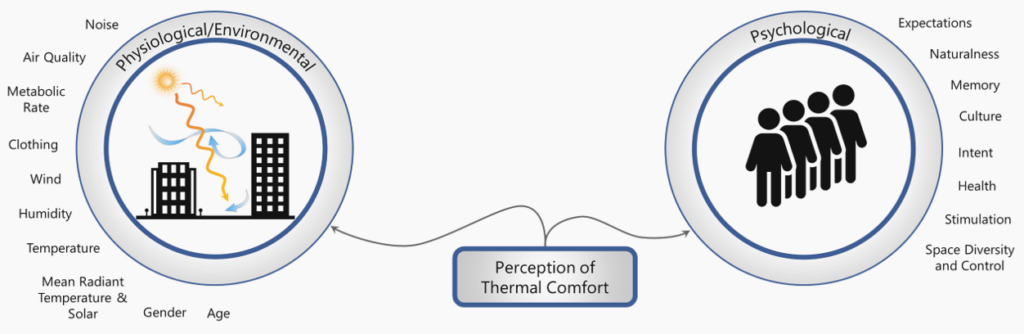
The thermal comfort analysis combines wind and solar simulations of your site geometry with a complex array of climate data, including temperature, humidity, cloud cover, activity level, clothing, wind direction and speed, summarizing the results in plots that indicate the overall thermal comfort of patrons in that space.
– Thermal Comfort Color Legend Explained
The color scale indicates the SPMV conditions for temperate climates:
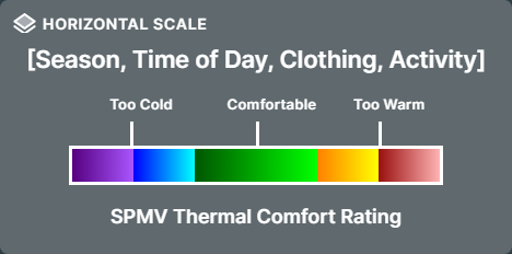
The color scale indicates three types of zone:
- Comfortable – this location is similar to indoors. No thermal stress.
- Too Cold/Too Warm – a person will stay at this location for some time but will seek better conditions.
Navigate to the Knowledge Base to learn more about thermal comfort metrics and interpreting results.
1.3 Shadowing
Orbital Stack takes a statistical approach to shadowing analysis. It indicates where shadows would generally fall for the given season (month range) and time of day (hour range), assuming the sky was clear every day of the year. Plots are generated for each season + time-range indicating the solar potential (from 0% to 100%) for the given period.
As a key driver of thermal comfort, being able to correlate and ultimately adjust the solar exposure of outdoor spaces is critical to achieving desirable outcomes.
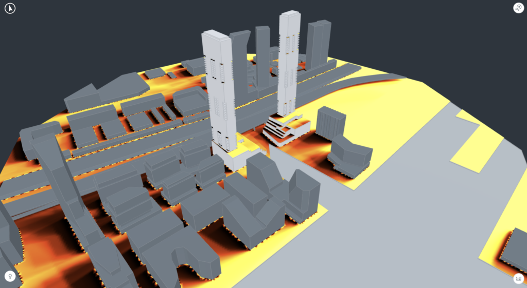
– Shadowing Color Legend Explained
The color scale indicates the amount of shadow and/or sunlight an area has the potential to experience:
- Black – fully shaded
- Bright Yellow – fully exposed to the sun
0% means a location does not see direct sun at any time during the specified Season and Time of Day. 100% means it is never shaded and completely exposed to the sun.
Navigate to the Knowledge Base to learn more about shadowing metrics and interpreting results.
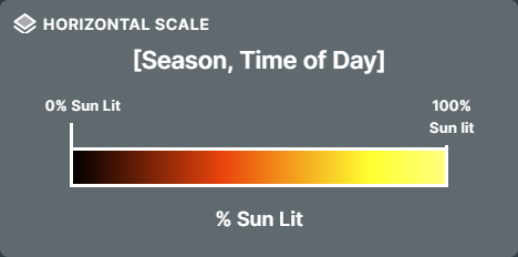
1.4 Airflow
Orbital Stack’s Airflow analysis examines a location’s wind patterns by evaluating winds one direction at a time, revealing potential issues with usability, comfort, and safety when winds originate from the given direction.
Ground level winds and spatial streamlines are mapped onto a virtual model of a proposed design in the context of the local built environment. These visual guides show how winds reach critical areas of the site, offering important insights into local directionality and informing the best choices for mitigations. Wind flows and wind intensities are generated from the simulations of individual wind directions by injecting a wind profile that corresponds to the upstream terrain conditions, as specified in the terrain parameter of the simulation setup.
Airflow data is presented using one of two scales, a relative scale which simply indicates where winds accelerate and decelerate, and a climate-adjusted scale which indicates the wind intensity to expect in a location on a windy day
Three dimensional streamlines (volumetric plots) show how winds move through the spaces between and around the buildings and help to illustrate how higher level winds impact the studied pedestrian spaces. Streamlines represent the raw simulation results and are displayed using a relative wind speed scale.
Pedestrian level contour plots (horizontal plots) show the wind intensity in the pedestrian realm (at ground or on terraces). These plots are scaled using the local climate data to reflect the directional differences in wind intensity. As such, they are displayed using the climate scaled directional wind speed legend.
– Relative Wind Speed Color Legend Explained
The color scale indicates the relative wind speed/intensity relative to a standard inflow condition. These results represent the raw results of the simulation relative to the injected wind profile, usually at 60m.
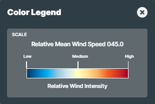
- Blue indicates regions where winds slow down.
- Yellow indicates winds that are close to the simulated wind.
- Red indicates areas where the wind accelerates.
The scale should not be taken as an absolute since it does not incorporate information about local weather patterns; it is only meant to indicate whether a specific location is expected to experience acceleration or deceleration of wind intensity.
– Climate Scaled Directional Wind Color Legend Explained
The color scale indicates a climate adjusted expectation of wind intensity. Results are scaled using historical weather data for the given wind direction to provide an indication of the wind speeds to expect on a strong wind day (80th percentile). Scaling using unique statistical subsets for each wind direction helps to highlight the impact of local climate and trends on the given study area (eg in Toronto, when winds blow from the south they are typically gentle, while when they come from the northwest, they are strong)
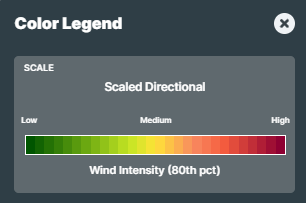
- Low indicates calmer wind speed regions that are generally comfortable for relaxed and passive activities
- Medium indicates moderate wind speed regions that are comfortable for more active use
- High indicates stronger wind speed areas that may occasionally be uncomfortable for pedestrian use.
For additional information visit: Streamlines and Generalized Wind Flows or navigate to the Knowledge Base to learn more about airflow metrics and interpreting results.
2. Wind Rose Explained
Wind Roses are helpful tools which display wind speed and direction at a specified season and location, but may be a bit difficult to interpret.
2.1 What is it measuring?
The Wind Rose displays three types of information:
1. The speed at which wind is blowing
The shade of each ‘spoke’ of the wind rose indicates a range of speeds at which wind blows, based on the legend displayed at the bottom. For instance, winds blowing from a particular direction may typically be low-speed, but might occasionally become much stronger. (See Below)
2. The direction from which wind is blowing
Wind direction (where wind is blowing from, not towards) is displayed in a compass configuration. (See Below)
3. How often wind blows from a particular direction at a particular speed
The radiating rings – and the accompanying numbers displayed with each ring – indicate how often wind blows from that direction at various speeds. This is shown as a percentage. (See Below)
– How to Read a Wind Rose?
During the Spring season at Toronto Pearson Airport, wind blows from due East for a total of 4.6% of the season. These eastern winds are indicated on the top left of the compass configuration.
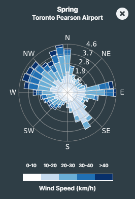
These Winds Speeds(km/h) blow at:
0-10 km/h for ~0.5% of the season
10-20 km/h for ~1.2% of the season
20-30 km/h for ~1.8% of the season
30-40 km/h for ~0.8% of the season
40+ km/h for ~0.3% of the season.
From the southerly direction , winds typically blow from the southeast. These SE winds are low-speed, typically blowing at 10-20 km/h, and do not exceed 30 km/h. Winds from the southwest – on the other hand – are far less frequent, but much more intense; when wind blows from the SW direction, they are typically above 20 km/h and sometimes exceed 40 km/h. Therefore, despite blowing less frequently than from the SE, these SW winds are considerably more impactful.